SquidGrid: a squid with its arms wrapped around a globe of circuit traces.

Global internet & provider monitoring · your own environment with alerting

See where the slowdown starts.

Every app, store, office and SaaS platform reaches your users across networks you don’t control. We continuously measure more than 1.9 million internet paths and compare each with its own baseline. When performance changes, you see the first handoff where conditions deteriorated, the networks on either side, and whether the same problem is showing up elsewhere. Add one lightweight probe per site to put your own paths in the same view.
1.9 million+ paths measured 23,000+ networks observed 190M+ hops recorded

See the internet slowing down before the ticket queue fills.

Every carrier, cloud, CDN and AI provider we measure — each graded against its own baseline and sorted worst-first — beside what every provider says about itself and what network operators are reporting. The globe draws the degraded paths between networks as they happen.

Start with the whole internet. Add your own sites.

Global view

The screen above, live.

  • ✓The live map, provider incidents and operator reports
  • ✓Provider Assessment Reports: a page per provider, status and measured paths side by side
  • ✓Social feeds: real “is it down?” chatter as it happens
  • ✓China gateway and subsea coverage
  • ✓Historical baselines and trends on every measured path
  • ✓One flat subscription
Your sites
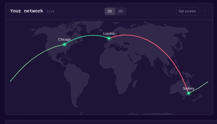
A real customer network in SquidGrid: three offices —
          Chicago, London and Sydney — with the measured paths between them drawn on
          the map, healthy in green and degraded in red.

Everything in the global view, plus your sites.

  • ✓Everything in the global view
  • ✓Office-to-office paths, loss, jitter, route and DNS changes
  • ✓Auto-adds the carriers found in your own paths
  • ✓Social feeds for the providers you depend on
  • ✓The same baselines and trends on your own paths
  • ✓Alerts when a link leaves its baseline — Slack or webhook, email coming soon
  • ✓Probes you run, priced per site

Built for anyone who gets asked why it’s slow.

NOC

The first changed hop, named.

We show the first handoff where latency or loss changed and name the networks on either side. No more guessing which hop.

Enterprise IT

Proof your vendor can’t shrug off.

Here’s what normal looked like, here’s the day it changed, here’s how long it’s dragged on. Hard to argue with a graph.

Service providers

Answer them on the first call.

While the customer is still on the phone, you already know which upstream the delay is on.

Managed services

Every client site you manage, one view.

Watch every client site you manage from one operations view, and know who to call before they’ve finished explaining the problem.

Leadership

A straight answer for the status meeting.

What broke, whose network it’s on, how long it has lasted. One sentence, no war room.

Remote & global offices

Prove it isn’t the branch office.

Every site-to-site path is measured in both directions, so “the London office is slow” turns into “the carrier between London and HQ is slow.”

Knowing it’s slow is the easy part.

Any dashboard can tell you the internet is having a bad day. Then comes the hour you spend proving it wasn’t your fault. That’s the part we built for: we show you where it’s slow, whose network owns it, and how long it has been going on.

Without it
  • ✗A dozen provider dashboards, none of them yours and none of them agreeing
  • ✗The first hour of every incident spent proving the problem isn’t on your end
  • ✗“No known issues on our side,” and no way to argue back
  • ✗Your case is three screenshots and a hunch in a Slack thread
With it
  • ✓One screen: your paths, every provider’s status, and the operator chatter, side by side
  • ✓The first changed hop identified, with the adjacent networks named
  • ✓Every path graded against its own baseline, so “it’s always been like this” doesn’t survive
  • ✓Loss, jitter, route flaps and DNS changes caught the hour they happen
  • ✓The places nobody else measures, inside China and under the sea, on the same screen

We measure it ourselves, then check it against everyone else.

Nothing gets called slow on one reading. Our probes flag it first, then we check the flag against routing data, provider status pages and operator reports before you ever see it.

path baseline routing / BGP status pages operator + social Probe fleet worldwide vantage points reading Correlation weighed against all four before it reaches you holds up Your screen both networks named
MeasureOur probes read every path from many places at once.
CompareEach path is judged against its own history first.
CorroborateThen checked against routing, provider notices and public reports.
ShowWhat survives reaches you — with both networks named.
A reading has to earn its way to your screen. Most one-off anomalies are filtered out before they reach you. Nothing is called slow on one look.

We compare every path to its own history instead of some number we picked. A 164 ms subsea path may be normal. A sudden 60 ms jump across town may not be. And provider grades come from measurements, not sponsorships.

See a live sample of what we measure.

Running continuously, open to anyone — no account, no sales call. Provider incidents on the right, degraded paths drawn between networks on the globe as they happen.

Also on YouTube at @SquidGrid.

Inside China, under the sea, and in the chatter

Most monitoring stops at the edge of the easy networks. The problems that blindside you live where nobody else is looking — behind a national gateway, at the bottom of an ocean, or in a thread full of people who noticed before any status page did.

China’s gateway gateway

China’s gateway

We watch 696 backbone routers across China Telecom, Mobile and Unicom, from fourteen directions at once — including overland paths through Kazakhstan that mainstream monitoring rarely covers. When Shanghai traffic changes route, the detour and its effect on performance appear in the same view.

Subsea cables Los Angeles Singapore your app

Subsea cables

Subsea maps show where cables are laid, not which route your traffic takes or whether a fault is affecting it. We pair published fault reports with live route measurements — so when a break sends your Singapore traffic through Los Angeles, you see both the path change and the performance hit.

First to notice is it down? anyone else? SG slow rn ! minutes early

The people already shouting about it.

Public operator and user reports can surface a problem before an official status update appears. We read the operator lists and the “is it down?” chatter the moment something breaks, and show it as third-party reporting — clearly labelled and kept separate from our own measurements.

The same probes can watch your network from the inside.

Put a probe where your people are.

Run our probe in your own sites and the same measurement follows the paths you actually depend on. One container per site, reporting in about a minute.

SquidGrid collector outbound HTTPS only no inbound ports Your office probe · one container Your other office probe · one container every path, measured from both ends
It sends measurement results only. Timestamps, latency, loss, jitter, DNS answers and traceroute hops — no shell, no root, no inbound ports. Delete the container and it is gone.

Here’s a real one — three offices, three probes, live paths between them.

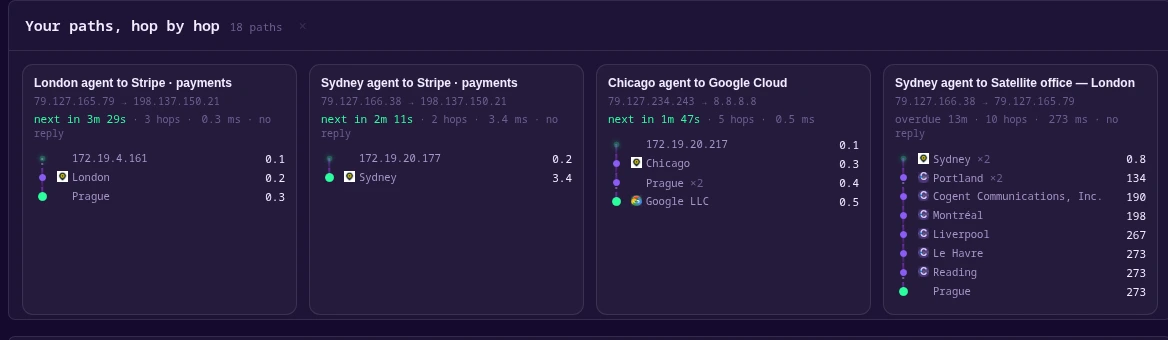
Every path between your sites, traced hop by hop. Each hop is named, with the latency it added — so a slowdown lands on one handoff between two networks, not on “the internet.”
The hop-by-hop view of a real customer network: paths from Chicago,
             London and Sydney offices to Stripe, Google and each other, every hop
             named — Cogent, Portland, Montréal, Le Havre — with its added latency.
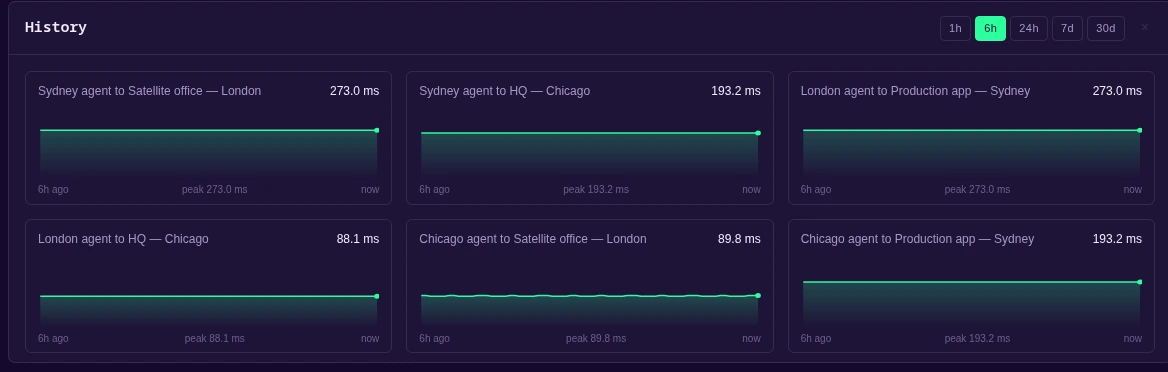
What normal looks like, kept. Every office-to-office link on record, so a change stands out against its own baseline instead of a number somebody picked.
Latency history for six office-to-office links — Chicago, London and
             Sydney — each a sparkline with its peak and current round-trip time.

What you get to see

One container per site. You could be measuring by this afternoon. No host installer, no inbound ports, no permanent system changes.

See pricing

Here’s everything above, side by side.

Pick the one that matches where the problem is.

Read The Squid’s Ink — our weekly internet health report →

  Global viewthe internet, measured Global view + your networkeverything, plus your sites
The whole internet
Every path we measure, more than 1.9 million of them✓✓
Carriers, clouds, CDNs and AI, grouped✓✓
2,800+ provider status feeds monitored; 200+ full assessment pages, kept after providers’ own pages forget✓✓
Provider Assessment Reports: live path measurements on every provider page✓✓
Social and operator feeds: real-time “is it down?” chatter✓✓
China gateway and subsea cable faults✓✓
Your own sites
Probes you run, in your own locations—✓
Links between your sites, both ends—✓
Hop by hop out of every site—✓
Packet loss and jitter, hour by hour—✓
Voice quality on your own paths—✓
Route changes and DNS drift—✓
Availability and kept history—✓
Auto-adds the carriers found in your own paths—✓
Your carriers' reports, filtered to you—✓
A dashboard you arrange yourself—✓
Alerts when a link leaves its baseline—✓
Getting it running
Installnothingone container
Runs unprivileged, cap-drop=ALL—✓
Priced byflatper site

Both are subscriptions and neither has a minimum term. Cancel anytime, and annual billing includes two months free.

See what we already know about your paths.

Tell us what you run online — a site, an app, a platform, or a whole network. If we already measure the paths that reach it, we’ll show you what we see first. Ready to start now? See pricing.

No single source decides what’s true. We measure every path from our own worldwide fleet, then test it against hundreds of independent sources — among them RIPE Atlas and RIPE RIS, services of the RIPE NCC. A reading that can’t survive being contradicted never reaches you.